July 21, 2021
How To Create a Law Firm Logo
Every business, no matter the niche, needs a logo. A logo defines what your firm represents and will impact how potential clients view your brand. As such, you need your logo to stand out and be true to your business.
What Is a Logo?
To understand a logo better, we have to understand what it isn’t. There are several concepts that many law firms and business owners misunderstand about the logo. It plays an important role, but it is only a piece of the puzzle.
Your Logo Is Not Your Brand
Your logo is not your brand but only a part of it. Your brand represents so much more: your representation, how people perceive you, and how you make people feel. It takes time to build a brand and requires consistency across all channels. Your logo design should reflect your firm and what it is about. It should remain consistent with every other visual of your firm’s projects.
A Logo Is Only a Part of Visual Identity
Another misconception that many business owners have is that the logo is the visual identity of your brand. If that is true, then many companies would have a hard time trying to jam things together in one picture. A logo is just a part of a much larger system. Aside from it, you’ll have to consider other visual aspects, including:
- Layout
- Photos
- Videos
- Colors
- Fonts
- And many more
Logo Definition
A logo is a symbol or design piece, often made of eye-catching imagery. It identifies your law firm, along with your services and team. You can use it to make a statement or carry a deeper meaning than what appears on the surface.
Designing a Logo
There are three general phases of logo design from start to finish:
Inspiration
Your team can start by collecting ideas or visuals through a brainstorming session. Put together a mood board of magazine cutouts or use Pinterest to assemble visual ideas from the web. This phase should be loose and fun, but you’ll always have to consider two things:
- Focus on your identity: What is your current identity and how do you want to change in the future.
- It must connect with your audience: How can your logo convey value to your target audience?
Everyone in the firm can get involved in these very early stages of logo design. Don’t be afraid to try and mix seemingly conflicted or out-of-the-box ideas. After you’ve gathered a good set of ideas, you can then seek out inspiration from similar sources. Here are some sources you can examine and gain inspiration from:
- Competitors: Check out the logos of competitors and see what they’re doing wrong and right. Learn from their mistakes and successes to inform your design process.
- Top brands: Popular brands are doing something right. Whether it’s their colors, designs, or creative implementation. You can check what works for others and if you can apply them to your design.
Start to narrow down the elements from your brainstorm that strike you the most. Pay attention to:
- Color combinations
- Images
- Designs
- Illustrations
- Other related creative items
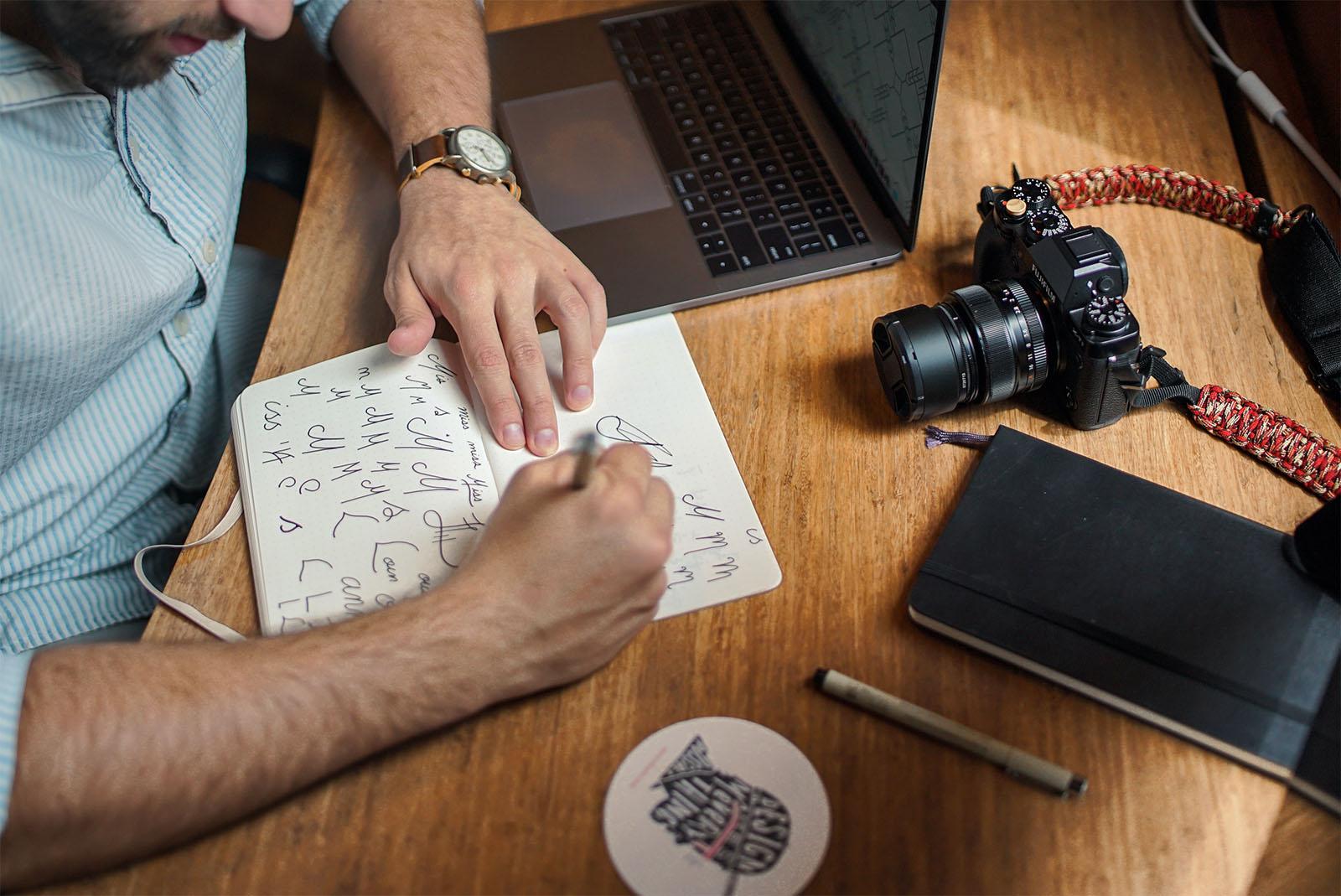
Pen to Paper
During the design phase, a sketch is often the best place to start. It has more room for mistakes, and you can create rougher designs before truly committing to one. You’ll often encounter other ideas that you haven’t thought of before and will consider them.
Start to draw the logo based on the narrowed down brainstorm. As you create this draft, find which specific design style resonates with your firm. Choosing one will give a better idea of the graphics, colors, fonts, and shapes included in the design. Here are some examples of popular design styles:
- Minimalist: A popular design style for many modern companies. These logos use fewer details, more space, and focus on simplicity.
- Handmade: A logo style that’s often associated with creativity and individualism. The advantage of this style is that you can use various design philosophies without sacrificing its core.
- Fun: These logos often use cute characters, symbols, and illustrations. The goal is to appeal to younger audiences by showcasing a positive and friendly vibe.
- Vintage: Vintage designs try to evoke feelings and moods of the past. They want you to feel nostalgic and look like they are tied to a rich history.
- Classic: Classic logos often appeal to more demographics and can signify elegance. It doesn’t try to go crazy with colors or designs. It gives a sign of maturity and confidence.
Finishing Touches
Lastly, you’ll need to vectorize the design through a program. The most popular tools are those released by Adobe. The reason they are popular is that they design using vectors, which are much easier to scale and format.
As you continue with the design, you’ll need to consider other elements as well:
- Fonts: Going for a serif, sans serif, or script can mean vastly different things. It must also match well with the other elements.
- Logo Types: Are you going for a picture, a word, or maybe a combination? You can go abstract or focus more on a character. There are many ways to approach the main attraction.
Once you’ve created a digital version of the logo design, it isn’t necessarily the end of the process. You may want to evaluate if it lines up with your goals. Ask each team member what emotions the imagery evokes and if they like it or if there’s something to improve. You can also ask opinions from people you trust outside the firm to get a second opinion.
You’ll probably make a few revisions until you like the output. It has to be something you’re willing to commit to for years to come, even decades. You will also have different versions. A common variation is a logo for dark backgrounds and one for light ones.
Then, you may want to add a few more details to finish up the design. Some common adjustments include:
- Sizing
- Fonts
- Orientation
- Positioning
- Colors
- Layout
Don’t be afraid to test modifications to see how it impacts the final result. As long as you still anchor to your plan, some unusual changes can even benefit the design. Then, you’ll check if it looks good on computers and mobile devices. You can also print it out to see how the colors and fonts work together outside a digital screen.
Take Your Time
It pays to invest effort into ensuring that it is something you want to put out there. It is something that will be a part of your brand for a long time. Your final output will reflect all of the work you put into it.
Remember that you don’t have to do it alone. You can hire professionals who know layouts, colors, fonts, and many more. We can help you cut down the work you need to do and can work with you through the law firm logo design process. Feel free to reach out to us if you need help with your firm’s logo design.
Share this post